UI Component Library
Description
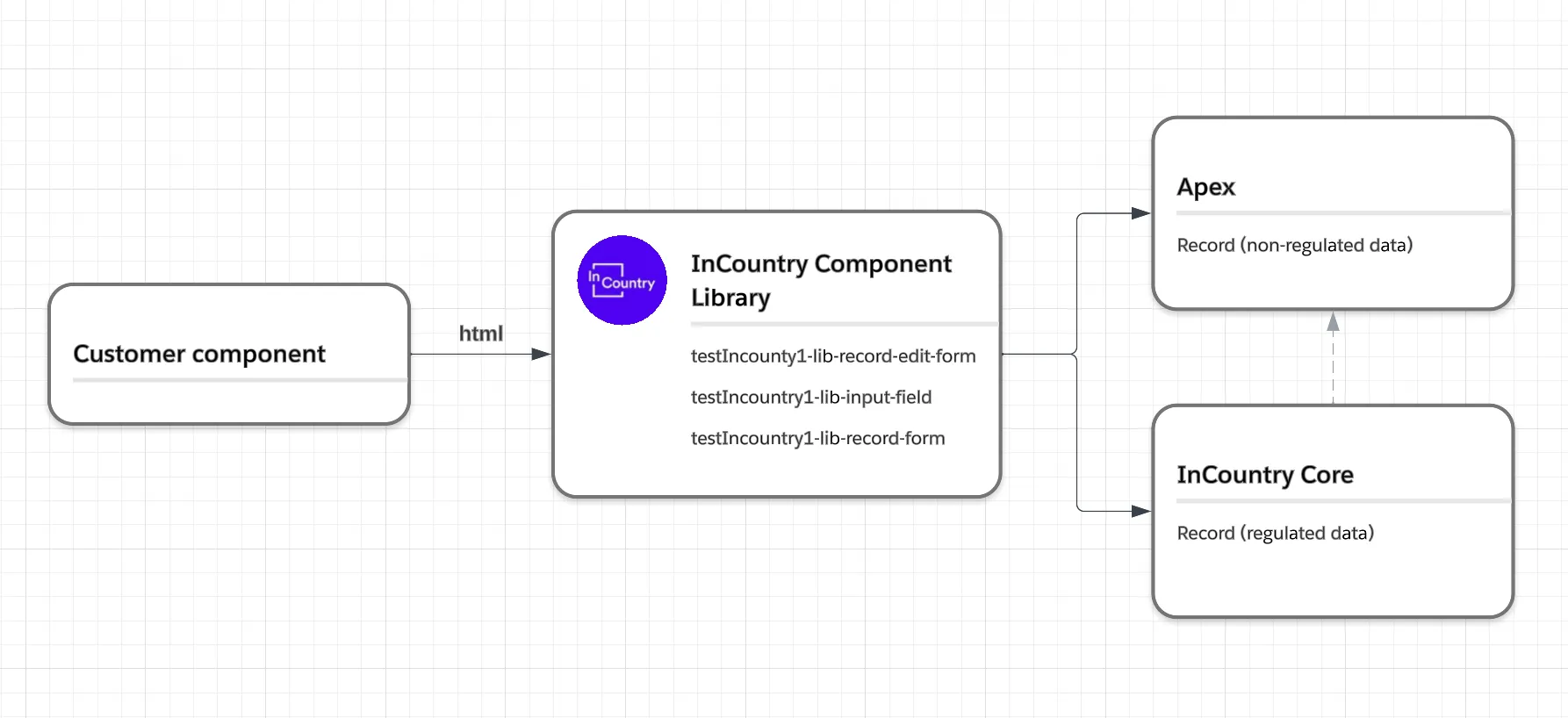
The InCountry Data Residency for Salesforce package provides the InCountry Component Library similar to the one available in Salesforce. InCountry Lightning Component Library refers to a set of pre-built and reusable components that developers can use to create dynamic and responsive user interfaces within the Salesforce Lightning framework. These components are based on the existing functions used in the package for reading and updating regulated records in Salesforce and on the InCountry platform.
Limitations
1. For correct operation of the library, LWS must be enabled in the Salesforce org.
A possible error message to indicate that LWS is turned off: Attempting to reference cross-namespace module testIncountry1-lib-record-edit-form in c-contactDisplayComponent.
Enabled LWS:
LWC:
-
testIncountry1-lib-record-edit-form -
testIncountry1-lib-input-field -
testIncountry1-lib-record-form
AURA:
testIncountry1:libRecordForm
Disabeld LWS:
LWC: You cannot use cross-namespace modules. For the details, please check Salesforce documentation.
AURA:
testIncountry1:libRecordForm
2. You cannot use testIncountry1-lib-record-edit-form, testIncountry1-lib-input-field inside the Aura component. In the Aura component, we can’t use a slot solution because Aura doesn’t support slots with components. For the details, please check Salesforce documentation.
3. Only Salesforce Duplicate rules are enforced.
Components
The library provides the following methods:
lib-record-edit-form
Use the testIncountry1-lib-record-edit-form component to create a form that's used to add a Salesforce record or update fields in an existing record on an object. The component displays fields with their labels and the current values and enables you to edit their values.
The testIncountry1-lib-record-edit-form component supports the following features.
-
Editing a record's specified fields, given the record ID
-
Creating a record using specified fields
-
Customizing the form layout
-
Custom rendering of record data
This component is an equivalent to the native lightning-record-edit-form component.
Attributes
| Name | Type | Required | Description |
|---|---|---|---|
objectApiName | String | ✅ | The API name of the object. |
recordId | String | ❌ | The ID of the record to be displayed. |
recordTypeId | String | ❌ | The ID of the record type, which is required if you created multiple record types but don't have a default. |
formClass | String | ❌ | A CSS class for the form element. |
density | String | ❌ | Sets the arrangement style of fields and labels in the form. Accepted values are compact, comfy, and auto (default). Use compact to display fields and their labels on the same line. Use comfy to display fields below their labels. Use auto to let the component dynamically set the density according to the user's Display Density setting and the width of the form. |
Methods
| Name | Type | Arguments | Description |
|---|---|---|---|
submit | function | fields - Array of record field names or field IDs. | Submits the form using an array of record fields or field IDs. The field ID is provisioned from @salesforce/schema/. Invoke this method only after the load event. |
Events
| Name | Type | Description |
|---|---|---|
onsubmit | event | Fires when user submit form |
onsuccess | event | Fires when status is success |
onload | event | Fires when form is loaded |
onerror | event | Fires when form has error |
Example
<testIncountry1-lib-record-edit-form
    object-api-name={objectApiName}
    record-id={recordId}
    record-type-id={recordTypeId}
    density={density}
    form-class={formClass}
    onsubmit={handleSubmit}
    onload={handleLoad}
    onsuccess={handleSuccess}>

    <lightning-messages></lightning-messages>
    <testIncountry1-lib-input-field field-name="Email"></testIncountry1-lib-input-field>
    <testIncountry1-lib-input-field field-name="FirstName"></testIncountry1-lib-input-field>
    <testIncountry1-lib-input-field field-name="LastName"></testIncountry1-lib-input-field>
    <testIncountry1-lib-input-field field-name="testIncountry1__Country_field__c"></testIncountry1-lib-input-field>
    <testIncountry1-lib-input-field field-name="AccountId"></testIncountry1-lib-input-field>

    <lightning-button
        type="submit"
        name="submit"
        variant="brand"
        label="Save">
    </lightning-button>
</testIncountry1-lib-record-edit-form>
lib-input-field
Use the testIncountry1-lib-input-field component in testIncountry1-lib-record-edit-form to display and edit the value of a record field of a Salesforce object. Use the field-name attribute to specify the API field name.
This component is an equivalent to the native lightning-input-field component.
Attributes
| Name | Type | Required | Description |
|---|---|---|---|
fieldName | String | ✅ | The API name of the field. |
disabled | Boolean | ❌ | If present, the field is grayed out and users can't interact with it. Disabled fields don't receive focus and are skipped in tabbing navigation. |
readOnly | Boolean | ❌ | Specifies whether an input field is read-only. This value defaults to false. Not supported for the following field types: rich text, picklist, multi-select picklist, and lookup. A read-only field is not disabled by default. |
required | Boolean | ❌ | If present, the input field must be filled out before the form is submitted. |
value | String | ❌ | The field value, which overrides the existing value. |
variant | String | ❌ | The variant changes the label position of an input field. Accepted variants include standard, label-hidden, label-inline, and label-stacked. The variant, if specified, determines the label position. Otherwise, the density setting of the parent form determines the label position. |
Methods
| Name | Type | Arguments | Description |
|---|---|---|---|
reportValidity | function | Reserved for internal use. | |
reset | function | Resets the form fields to their initial values. | |
setErrors | function | fields - Reserved for internal use. | Reserved for internal use. |
updateDependentField | function | fieldName - Reserved for internal use. options - Reserved for internal use. | Reserved for internal use. |
wirePicklistValues | function | picklistValues - Reserved for internal use. | Reserved for internal use. |
wireRecordUi | function | record - Reserved for internal use. | Reserved for internal use. |
Example
<testIncountry1-lib-record-edit-form
    object-api-name={objectApiName}
    onsuccess={handleSuccess}>

    <lightning-messages></lightning-messages>

    <testIncountry1-lib-input-field
        field-name="LastName"
        value="testValue"
        variant="label-stacked"
        required="true"
        read-only="false"
        disabled="false">
    </testIncountry1-lib-input-field>

    <lightning-button
        type="submit"
        name="submit"
        variant="brand"
        label="Save">
    </lightning-button>
</testIncountry1-lib-record-edit-form>
lib-record-form
Use the testIncountry1-lib-record-form component to quickly create forms to add, view, or update a record.
Using this component to create record forms is easier than building forms manually with testIncountry1-lib-record-edit-form. The testIncountry1-lib-record-form component provides these helpful features:
-
Switches between view and edit modes automatically when the user begins editing a field in a view form
-
Provides Cancel and Save buttons automatically in edit forms
-
Uses the object's default record layout with support for multiple columns
-
Loads all fields in the object's compact or full layout, or only the fields you specify
This component is an equivalent to the native lightning-record-form component.
Attributes
| Name | Type | Required | Description |
|---|---|---|---|
objectApiName | String | ✅ | The API name of the object. |
recordId | String | ❌ | The ID of the record to be displayed. |
recordTypeId | String | ❌ | The ID of the record type, which is required if you created multiple record types but don't have a default. |
fields | String[] | ❌ | List of fields to be displayed. The fields display in the order you list them. |
layoutType | String | ❌ | The type of layout to use to display the form fields. Possible values: Compact, Full. When creating a new record, only the full layout is supported. |
mode | String | ❌ | |
columns | Integer | ❌ | |
density | String | ❌ | Sets the arrangement style of fields and labels in the form. Accepted values are compact, comfy, and auto (default). Use compact to display fields and their labels on the same line. Use comfy to display fields below their labels. Use auto to let the component dynamically set the density according to the user's Display Density setting and the width of the form. |
Methods
| Name | Type | Arguments | Description |
|---|---|---|---|
submit | function | fields - Array of record field names or field IDs. | Submits the form using an array of record fields or field IDs. The field ID is provisioned from @salesforce/schema/. Invoke this method only after the load event. |
Events
| Name | Type | Description |
|---|---|---|
onsubmit | event | Fires when user submit form |
onsuccess | event | Fires when status is success |
onload | event | Fires when form is loaded |
onerror | event | Fires when form has error |
Example
LWC:
<testIncountry1-lib-record-form
    object-api-name={objectApiName}
    record-id={recordId}
    record-type-id={recordTypeId}
    fields={fields}
    layout-type={layoutType}
    mode={mode}
    density={density}
    columns={columns}
    onsubmit={handleSubmit}
    onload={handleLoad}
    onsuccess={handleSuccess}>
</testIncountry1-lib-record-form>
AURA:
<testIncountry1:libRecordForm
    objectApiName="{!v.objectApiName}"
    recordId="{!v.recordId}"
    recordTypeId="{!v.recordTypeId}"
    fields="{!v.fields}"
    layoutType="{!v.layoutType}"
    mode="{!v.mode}"
    density="{!v.density}"
    columns="{!v.columns}"
    onsubmit="{!c.handleSubmit}"
    onload="{!c.handleLoad}"
    onsuccess="{!c.handleSuccess}"
/>